Landing Page Copywriting Best Practices – 6 steps to improve landing page conversions
If you head to Google today to look for a simple list of landing page best practices to implement on your site, I’ve got some good and bad news for you.
The bad news is, simply throwing a few best practice approaches at your landing page isn’t going to solve any problems. That is, unless they’re part of a wider strategy and approach.
The good news?
I’m sharing a swift audit process that uses copywriting and landing page best practices I’ve used that have increased conversions up to 42%.
Your AI still sounds like AI.
The free AI Foundation Framework loads your business, your voice, and proven writing rules into Claude, ChatGPT, or anything agentic. About fifteen minutes to install.
Drop your email below and I’ll not only send you a simple checklist to make finding your next winning landing page optimisation immeasurably easier. . Enter your email address here…
I’m also like 99% sure this process will help you sell more as well.
Why?
Cause the reason these landing page best practices and process works is because it addresses the same conversion killing errors I see brands make across multiple sites and pages.
But I’m not here to chastise.
I’m here to give you the tools and process to quickly identify how to increase the persuasive argument of any landing or sales page.
Let’s get into it.
Before you begin optimising your landing page…
I wish I could tell you I have the magic key to all of your copywriting and conversion woes.
That these landing page best practices and process will work regardless of page, process, brand or industry.
But I can’t.
Because doing so would be bullshit.
You see, great copy and messaging comes from one place.
Your audience.
They’ll tell you what it is they’re struggling with, the features of your product/service they most value, how they use or want to use your offering.
They’ll tell you what it is you need to offer them for them to buy from you.
But, this is a static, generic blog post.
Ain’t no way I could get my hands on that info for you and every other reader.
So here’s what this landing page best practice guide offers.
This guide explains the main thought processes and actions you should take to ensure each of your key landing pages are clearly selling your service.
More specifically, this guide is all about improving the copywriting and messaging for your landing pages.
You could implement the steps here without doing any research.
If you did, you’d likely see a small bump in conversions.
But if you have your research to help back these actions up, well, you could see a huge increase in conversions.
The short of that little caveat is “do your bloody research first. Understand your audience and simply repeat to them what they most like, need, and want to make an impactful impression”.
Now, let’s get onto the good stuff.
Landing Page Best Practices
If you’re here I’m assuming you know your audience.
You have, at the very least, a basic understanding of what they love about your product or service.
You know their primary pain points, how you help solve them, and the features of your product/service they find most valuable.
With that in the bag, I want to run over a few key considerations and general landing page best practices before we get into the details.
These are higher level approaches that should inform your overall approach to crafting better LPs.

Landing Page Best Practices #1 – Your opinion doesn’t matter
You might be the founder of a multi-million dollar company.
You may well have grown your brand from absolutely nothing to an industry leader from your grandparent’s basement.
But you are not your customer.
They don’t care about your credentials.
They don’t care about your hardships.
And they don’t care about your opinion.
What they do care about is the problem that’s keeping them awake at night and how you can solve it.
So take your ego out of the equation and give the end-user what they want and need to hear.
This is why your up-front research is so damn important.
Seriously, this isn’t a landing page best practice. This is a general marketing best practice. Your customer is the only one who matters.
Figure out how you can serve them to generate revenue.
Landing Page Best Practices #2 – Measure everything related to revenue
You wanna know if this process will make a difference, right?
If it moves the needle?
So you’re gonna need to measure everything.
You’ll wanna know, as a start;
- The traffic to the page you’re optimising
- The conversion rate
- Heatmap scroll level
- And how many of the people who convert on the page eventually end up paying for your service
You’ll want to know all of this before you action any changes.
That’s gonna be your benchmark.
When you’ve made the changes, check to see what’s happened to those metrics (over a similar time period).
You should see a change, hopefully positive.
But that change is gonna tell you whether these new amendments are on the right track and if you should pursue this new messaging.
Landing Page Best Practices #3 – Trust your research data – it reigns supreme
This is a tie-in with the above.
Your opinion (and that of your marketing team) isn’t important. But the opinion of the consumer is.
So you need to start everything with the basics of research to understand what it is they want, need, desire, and despise.
This (unfortunately) isn’t the piece to go into detail on this research cause it’s an incredibly long and laborious process.
So here’s what I’m gonna do.
I’m gonna outline a couple of research methods you should be using to understand your audience and link out to a few choice pieces that explain how to do it well.
Customer interviews
These are the best way for you to understand what it is your customer wants.
All you’ve got to do is select your best customer (those with the longest time using you, highest LTV, best engagement or whatever your primary revenue metric is), get them on the phone and ask them questions about how and why they use your offering.
These can be quite time consuming, so you really want to focus your efforts on the ideal, most profitable customer segment.
Watch this if you need a little help with the approach.

Customer surveys
A second-best method of getting word right from the horse’s mouth.
Again, you want to try and limit respondents to those who are your ideal customer segment – those with the greatest revenue per user/LTV.
However, you’ll also be able to do this on a much larger scale because a single survey can be sent to hundreds of your ideal customers with a single click.
Read this for a great breakdown on the age-old open vs closed question debate.
Support and sales team interviews
The sad fact is the internal teams for most brands simply don’t communicate.
Your sales and support team (the guys and gals talking to customers every single day) have a wealth of information about what they want and need from you.
Asking these people for the most frequent issues is almost as good as speaking to the customers yourself… almost.
Analytics analysis
Take a look at your analytics reports with particular focus on the user journey and points of most significant drop off rate.
Often, you’ll find that low converting pages are struggling because they’re part of a confusing journey. Sending a user from a page that focuses on A to a page that explains B is confusing and will lose customers.
I also like to identify a couple of higher-performing similar pages to see if there are any common traits or trends among them that can be implemented on the page you’re optimising.
Probably the best single resource for analytics analysis and setup for landing pages.
Review mining
If you’re a brand new company with no customer base to draw from, fear not.
You can get a leg-up on the competition simply by reading reviews on third-party review sites.
A few sites you’ll want to consider are listed below.
- G2Crowd
- Capterra
- Quora
Hell, you can even pick up some insights from Amazon book reviews that cover the problem you’re trying to solve.
If you want to check out a great guide, check the piece I created on conversion copywriting for Crazy Egg which still ranks #1 for the term conversion copywriting.

Landing Page Best Practices #4 – One page, one purpose
What’s your page trying to achieve?
That’s a key question to ask yourself at the start of this process.
Your page should have literally one goal. It could be to book a demo, sign up for a trial, download a resource, or even to drive a sale.
It should be one of these things. No more.
Seriously, it pains me to see pages that have 4-5 different goals and actions.
I’ve seen pages that should be focused on securing a trial, yet have full sections devoted to blog content, resource downloads, and weird links to find out more about the founder.
A singular focus reigns supreme.
It helps keep all of your messaging aligned and focused on the major pain point/benefit that best appeals to your targeted segment.
Landing Page Best Practices #5 – Pick a specific audience segment and page
A lot of brands focus their optimisation efforts on their home page.
Problem is, your home page is going to be viewed by the full gamut of potential customers. And that makes it real-fucking-hard to ensure it appeals to them all.
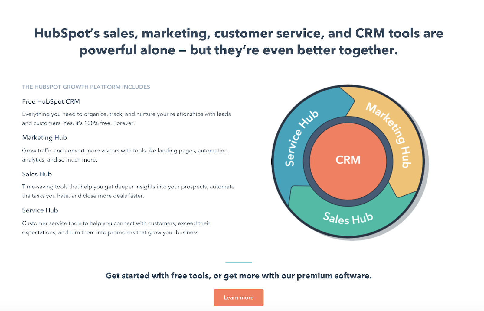
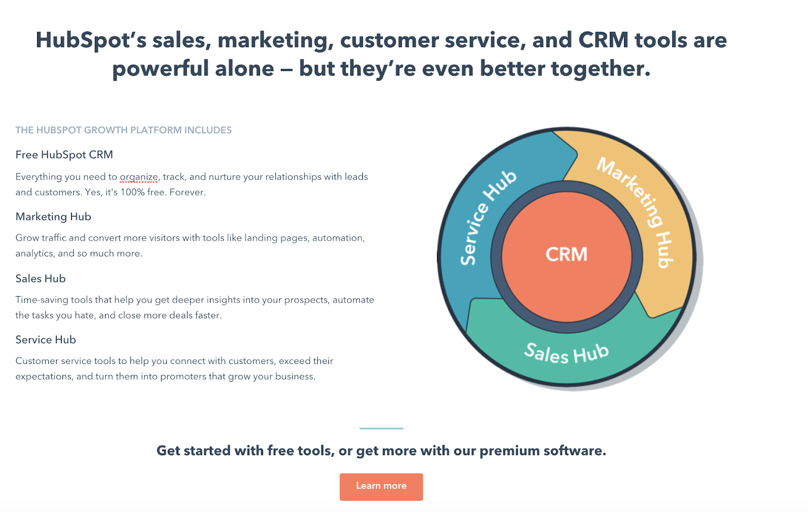
A better use of time is to build segment-specific pages and drive targeted traffic to them. Take HubSpot for example.
They have a tonne of different services aimed at different businesses, industries, and segments within those industries.
Do they smash it all onto one single landing page?
Nope.
They build out specific landing pages that focus on specific features/benefits that appeal to specific businesses and needs (more on this later in the breakdown).
You’ve got to try and do the same.
The more specific you can make the targeting of your page, the more likely you are to see it convert.
Landing Page Best Practices #6 – Work backward
Start at the end.
Figure out what you want people to do and work backward from there. It makes the whole process so much easier when you know what you’re building towards.
Building a new house begins with drawing the plans for the final design. The builder goes in with an image of the finished product before the first brick is laid.
That’s what you’re aiming for here.
Know what you want to achieve and what success looks like. Work backward from there until you find your start point.
Landing Page Best Practices #7 – Clarity over all
This is one of the things that a lot of folk overlook.
Clarity reigns supreme.
In everything you do with your landing page, you need to make sure that a few things are crystal clear for the user.
- The message – or more accurately what you want to communicate to the user.
- The action – Your CTAs shouldn’t be clever or witty. Just tell the reader what to do and what they’ll get.
- Your images – They need to help clarify your message in your copywriting and, at the same time, but easy to understand themselves.
Clarity over all. This is one of the most important landing page best practices. A lot of great messaging is lost because someone, somewhere decided to try and make the message sound “smart” or “sexy”.
Thing is, there’s nothing sexier or smarter than a clear message that makes sales.
So finally, after over 1000 words of preamble (albeit important preamble), let’s get into the actual process of running a quick copy and messaging audit on your page.
6-steps to improve weak landing page copy
OK, so you know what you should know and now we’re getting into how to apply it.
To turn this from one of those annoying, high-level pieces that talk in mystical terms without any real landing page best practices being explained, I’m going to break down a page from HubSpot.
As mentioned earlier, it’s a targeted page.
It’s not selling all of their various services and features. It is focusing on a single offering making it much easier to outline the benefits.
It’s not perfect (if it was this article would be pretty useless), but it is a better example than most of the pages out there.
You can find the page itself by clicking here.
However, as pages on the internet are frequently updated and optimised (if the marketing team is doing their job) I’ve included a copy of the page as it was when I wrote this in the downloads.
Landing Page Audit Step 0 – What’s the goal?
What you want/are looking for – A single action you want the user to take.
So, as outlined above in the various landing page best practcies run down, we’re gonna start at the end and work backward.
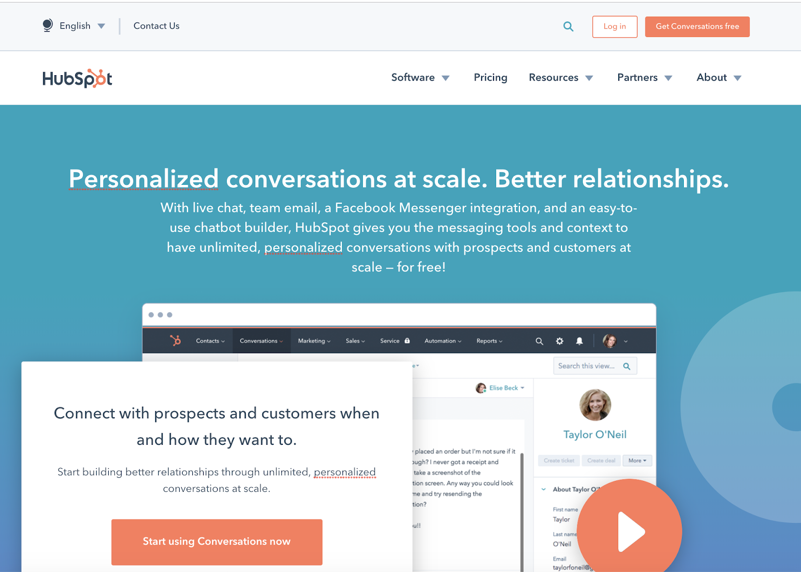
What’s the primary goal of this HubSpot page?
In this case, it’s pretty clear.
Right in the above the fold section we can see that there are 2 CTAs for the same action.
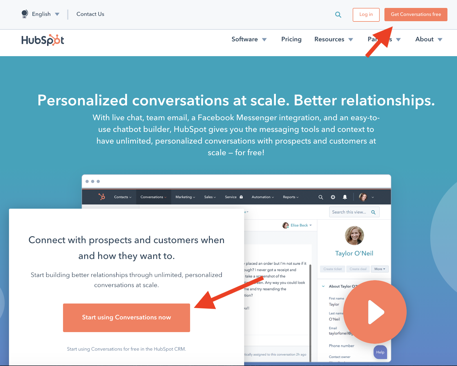
Both of which are to download the conversations feature to the user’s HubSpot account.
However, it becomes a little more muddled later down the page.
The final CTA prompts users to the same action.
And yet, just above it, there’s a section including a different CTA.
Now, I understand the importance of including this.
If you read the excellent guide from fellow copywriter Joel Klettke, you’ll know a lot of work went into better communicating the growth stack potential of HubSpot.
But I’m not certain a CTA to a competing page helps.
Again I’m gonna reference the general landing page best practices and remind you of “one page, one purpose”
I’d recommend leaving the explanation and removing the competing CTA because it creates two purposes of the page.
You can include multiple CTAs, but they should all prompt the same action and lead to the same destination.

The above illustration contains 3 different CTAs throughout the page, but they all need to lead to the same next step.
Doing so helps keep your page focused on the issues that matter to the user.
Landing Page Audit Step 1 – The once over
What you want/are looking for – An overall impression of the page. A quick overview of layout, images, and amount of copy.
This is a very quick run-through of the page.
You’re looking mainly for design elements here and to ensure everything, from a high-level, aligns with the above mentioned landing page best practices.
In particular, you’re looking to see if everything is clear and easy to understand.
The primary elements I always look for in every page include:
The fold/Hero section
Does it have the four key elements every fold section should have? Those being;
- A clear headline (clear in terms of placement/design – we’ll get to the wording later)?
- Is the sub-head easily visible and of a relevant length?
- Is there an image/video that shows the product in use or supports te headline?
- Is the CTA visible above the fold?
I want all of these things to be seen above the fold.
Why?
Cause if you check heatmaps for most pages around 50% of users scroll down less than a single screen.
That means they look at the fold, scrolls down to look at the next headline and then quit.
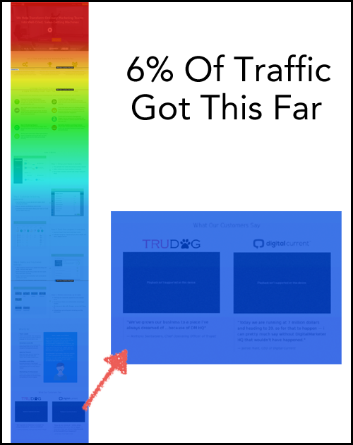
You need to lead with something that’s strong. You need your primary selling point, explanation, image, and action to be immediately visible.
If they’re not, then ~50% of the people who land on your page won’t see some of the key information they need to make an informed decision.
Let’s take a look at that HubSpot page again and break down the fold.
This is the above the fold section on that page.
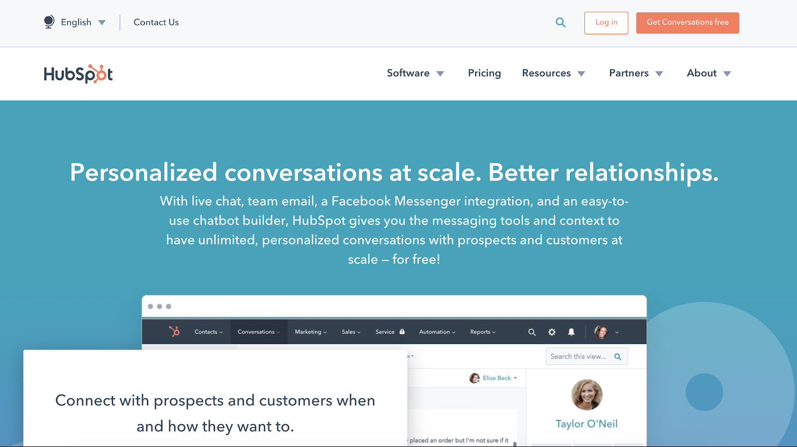
The spacing here seems a little odd to me, likely because of the double top navbar.
You don’t get to see the primary CTA or the video play button without scrolling down.
You could argue that it’s not a huge issue as there’s another CTA in the top right (on the sticky navbar), but the headline draws the eye away from that.
Personally, I’d run a test to try and cut things down here. Have the 4 key elements immediately visible on-page at initial load and analyse heat maps and CTR of that hero section CTA.
Copy
We’re not going to analyse messaging just yet.
However, we are looking to see if there’s a natural flow to the copy throughout the page.
Specifically looking to see if:
- Sub-heads are well spaced
- Descriptive text is easy to scan and not too bulky
- Everything is easy to read (font, spacing, white space etc)
- Use of bullets or other elements that make text easier to read
Generally, this page isn’t bad. However, I do feel like a lot of the text is too wordy.
Most modern consumers don’t read. They skim.
But if you look at the sections immediately following the hero there’s a lot of text there.
We’re talking chonky paragraphs with no real formatting.
I’d like to see if these could be rewritten to make the key benefits more easily communicated in shorter form, maybe with the smart use of bullets.
Now, you might be saying, “but Pete, I’ve heard long copy converts better than short copy”. And generally, you’d be right.
However, even the longest-form sales pages are easy to skim and scan.
These blocks of text make the page difficult to quickly read. Which, in my experience, will cause more people to drop off and bounce.
You’ve got to cut it down and make your copy easy to read to get the best results.
Exercise brevity and ensure your messaging is so clear even an idiot child could understand it.
I guess that’s an additional landing page best practice I forgot to include above…

Design
How does the page look and feel?
As mentioned above, people skim and scan. Which tells us they’re not here to analyse each and every detail.
They’re gonna try and understand what it is you’re trying to say as quickly as possible.
So your design has to help them do that.
Again, a few key things to look for here are:
- Are images instructional (do they help the user to understand)?
- Does whitespace make the text easier to read, understand, and assimilate?
- Is there a natural, visual flow to the page?
Again, at this point, you’re just giving this a quick look. Your job right now is to highlight any major issues with the general design and flow of the page.
Now let’s get onto the messaging of your page.
Click here to get the landing page best practice audit checklist (and a PDF of this piece)
Drop your email below and I’ll not only send you a simple checklist to make finding your next winning landing page optimisation immeasurably easier. . Enter your email address here…GET YOUR LANDING PAGE CHECKLIST NOW

Landing Page Audit Step 2 – Value prop
What you want/are looking for – A clear statement of what you offer and why your customer should care.
It pains me to read most value propositions today…
…Too many brands run vague bullshittery as their leading statement. The kind of thing the corporate board thinks sounds “executive” or “professional” but is just confusing or lacks any real information.

… Others run taglines, not value props. Which fail to resonate with real users because they lack clarity.
… And the worst of all simply copy what the competition is doing.
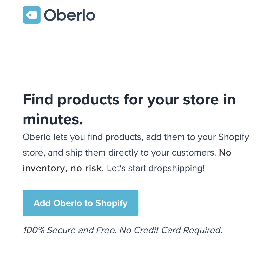
Oberlo, a very well known brand in the dropshipping space and a competitor’s attempt which is a very similar messaging copy.
Value props are often overlooked in favour of more technical or design landing page best practices.
Which is wrong cause even the best design will fail if the customer has no idea what it is you offer and what makes you unique.
Here’s the short of how to write a value prop that – whilst not winning any creative awards – does its job.
Your value prop should be a promise.
A promise of what your brand offers and how it’s going to help the user.
It sets the tone and message for the entire page and message. It is the guiding principle of what you’re trying to communicate.
It sits at the top of the hierarchy and determines whether your lower page messaging is relevant (more on the hierarchy later).
Because it’s so important, it’s difficult to really nail your value prop.
Fortunately, I’ve developed a simple, three-step checklist to help with value props.
Your value prop might not be the most creative using this, but it will accurately communicate the value of your offering.
The checklist is:
- How
- What
- Why

Here’s how they break down.
How and what are linked.
Your value prop should tell the user;
- What you actually do (as in, what is the core of the actual service)
- How your product/solution is going to help them
The why is a little different. How and what are very direct. They’re literal.
The why speaks more to the psychological reasoning behind taking the action.
So you could class it as;
- Why should the user care?
To sum up, how and what are explicitly stated.
Why they should care is implicitly insinuated… or alluded to… or not said.
Now, I know this sounds like the vague bullshittery I was complaining about above. So let’s put it in real terms.
Recart, an old client of mine, had one of the most direct and easy to understand value props I’ve seen in recent times.
It’s so good, I actually added it as one of the first entries to our copywriting examples page.
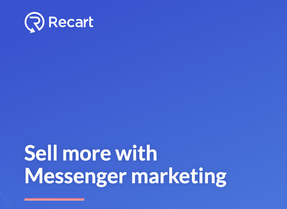
Let’s analyse that with the how, what, and why approach to value props.
What is it you do?
We focus on Messenger marketing
How’s it gonna help my business?
It’ll help you sell more
Why should I care? (implied benefit)
Because profits will increase.
Within 5 seconds the user knows exactly what Recart does and why they should care.
And thanks to the unspoken (but alluded to) message of profits, the financially focused brands will be interested.
This How, What, Why method isn’t a common landing page best practice or approach cause, well, I made it up.
But it will help you create a far clearer value prop that acts as a promise.
Which will lead to more conversions.
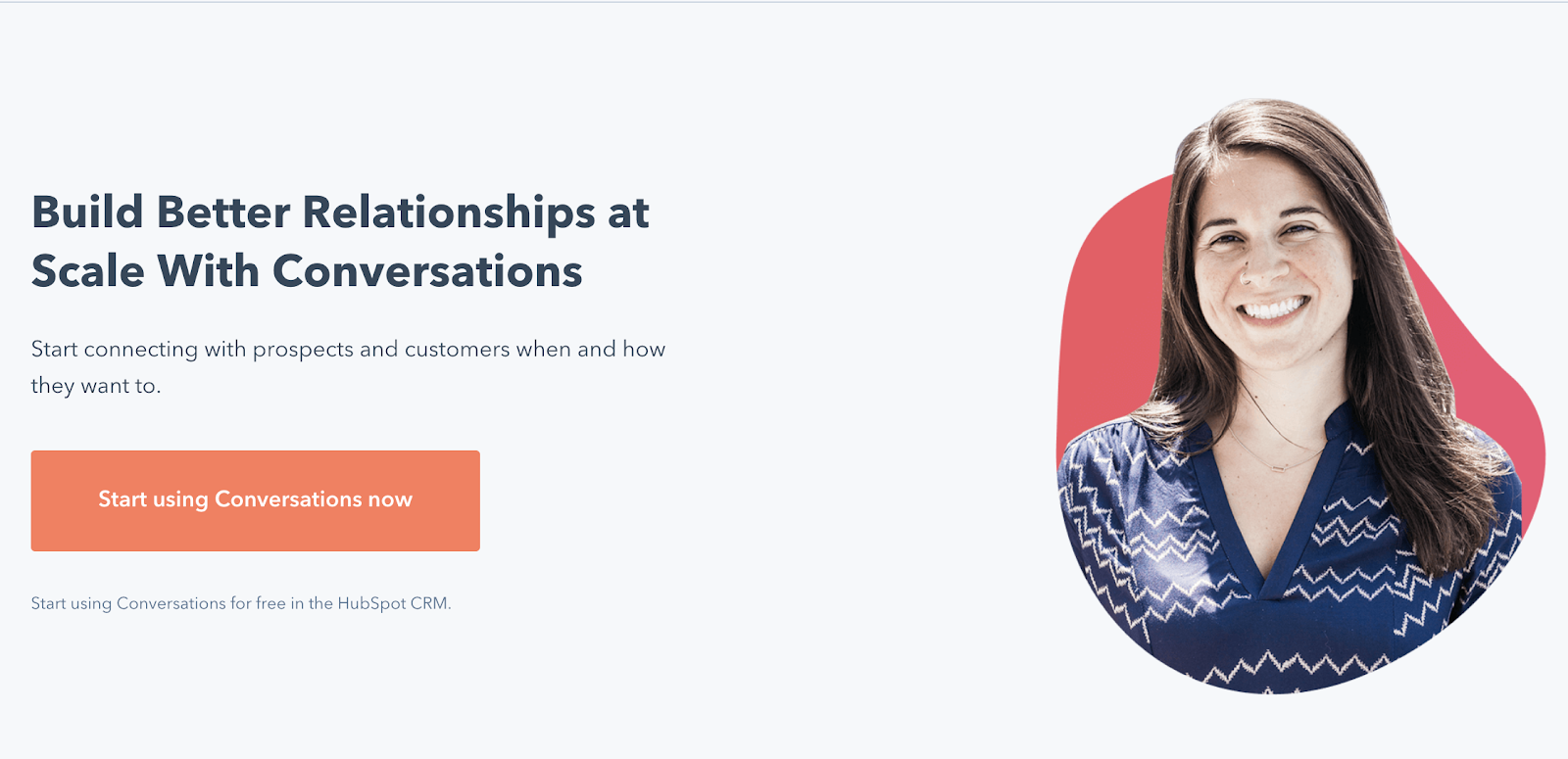
So how does the HubSpot page stack up?

This is their value prop.
I feel it could use a bridging word or two between their two sentences.
But when it comes to the how, what, and why, the bones of it are there.
- What – Personalized conversations (at scale)
- How – Better relationships
- Why – Better results with lower time investment
HubSpot have included “at scale”, which makes me think they’re targeting busy marketers who don’t have the time to manage that many conversations.
That simple inclusion makes me think the underlying reason their audience needs this is because they don’t have enough time or manpower to do this at scale.
And so, for me, the psychological element here is tied to a lack of time and feeling overworked. Thus the benefit is saving time.
HUGE CAVEAT – As you’ve probably guessed, I’m speculating what HubSpot are targeting. You should have done your research. You should know what feature your customers most value (the how), what problem helping them solve (the what), and how it’s impacting them on a personal level (the why).
In the video breakdown of this page, I think I actually rewrote the VP for clarity but retained the same message (of saving time – you can see that video in the downloads below).
However, for this write up I’m gonna leave it as is.
Now, onto the subheads.
Landing Page Audit Step 3 – Subheads
Subheads are your next most important element after the value prop for a number of reasons.
- They establish the flow of your page
- They’re what most people (as skimmers) will read
- When well selected, they keep everything on message
- They help justify the promise made in the VP
I’m going to quickly cover the concept of number 4 before moving on.
Your value prop is the promise, right?
It’s how you help and why they should care.
Well, the general landing page best practice is to ensure everything that follows your value prop justifies that promise. Not to you, and not really to the reader.
But to whoever the reader reports to.
This is true in both B2B and B2C worlds.
A lot of long-form sales pages do the heavy lifting in the first 500 words (the lead). The rest of the page is there to bolster trust and give the readers an argument.
An argument which they can take to their husband/wife and use to justify why they’ve spent that money.
In B2B pages, you’re hooking people with the promise then building trust and giving them an argument to go to their boss with.
You’re basically making it easy for them to justify to the holder of purse strings why you’re worth the investment.
Equally as important are how subheads dictate the flow of the page and help keep you on message.
This is where the hierarchy of messaging comes into play.

Your value prop, USP, UVP, main headline, or whatever you want to call it sets the tone.
Your subheads need to be directly related to and support the main message your value prop communicates.
The subheadings should list the most commonly mentioned/used features and benefits you discovered in your research.
They should focus on – in descending order – the primary pain points your users feel and how you’re helping to solve them.
And they must be related to the primary message.
Remember the key landing page best practices, specifically one page, one purpose. That also means one page, one message.
The primary message of this HubSpot page was saving time, right (that’s the why part from above)?
So, all subheads should be somehow related back to that primary message.
I mean, if you’ve done your research the value prop is the biggest problem and promise. So hitting that emotional nail throughout the page will make your arguments more compelling.
Don’t misunderstand though.
I’m not advocating you simply say “saves time” over and over again.
There are ancillary pain points and benefits that are closely related to your primary promise (pain points and benefits you should understand from your customer research).
I’d recommend exploring what those are for your primary benefit. I’d also recommend going two levels deep.
Here’s an example of how it might look when you go 1 level and 2 levels deep of related benefits.
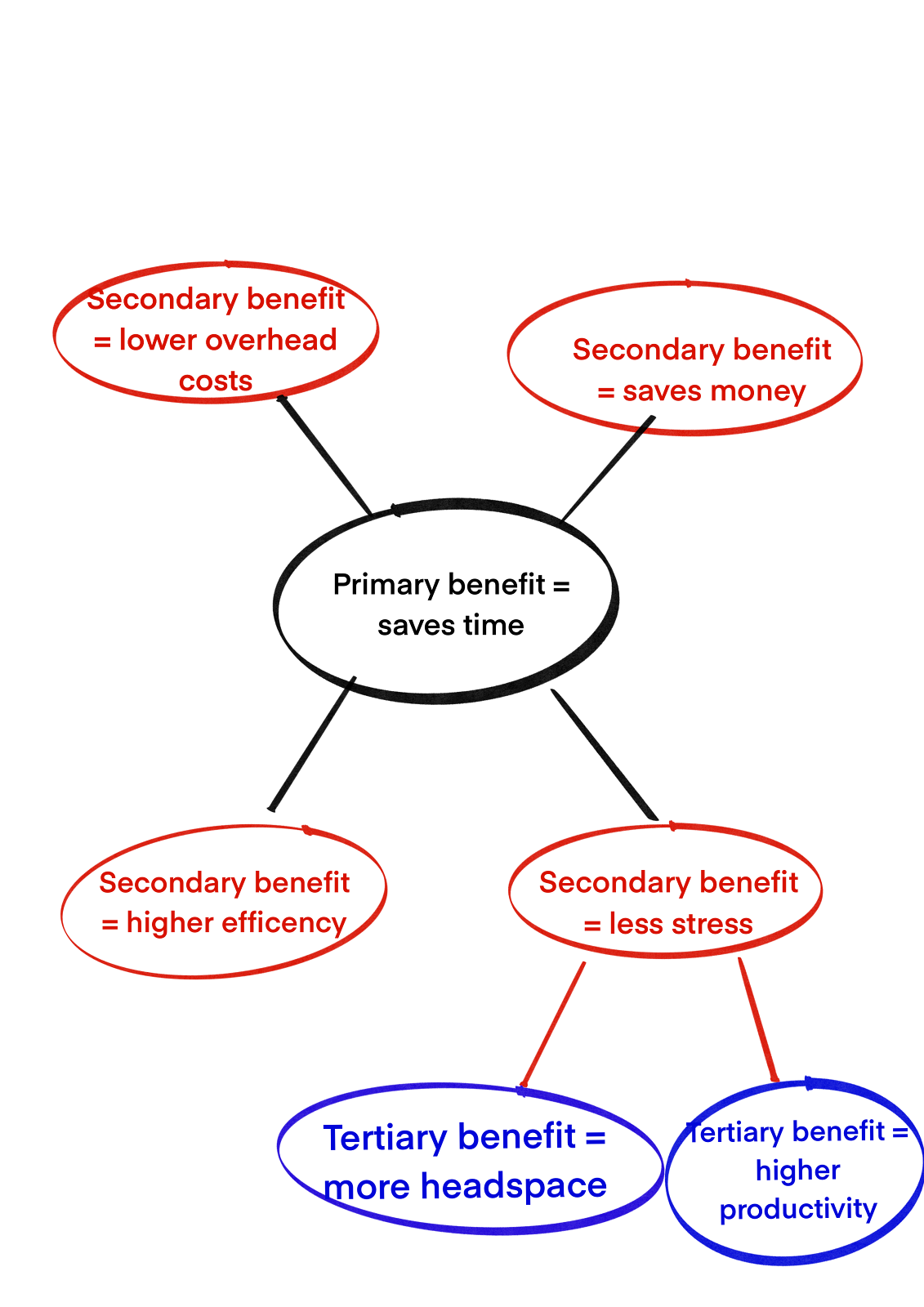
These are the benefits/pain points you should be focusing on throughout the page with your subheads.
Don’t worry about bludgeoning your audience with that primary message. Your audience isn’t stupid and can fill in the gaps.
If you’ve done your research, then you’ll know which of these related issues are being experienced making prioritising and cutting much easier.
If you’ve not done your research, go back and do it now. Otherwise, you’re just guessing.
Let’s take a look at the subheads used in the HubSpot example and see whether they hit the above-mentioned requirements.
We’re gonna run through these landing page best practices checks in a particular order.
- Are the sub-heads related to the primary promise/emotion?
- Do they maintain the flow of the page?
- Are they clear in their benefit?
So let’s go through them.
Here’s the thing.
I actually wrote out a full breakdown of each of the subheads and it took up almost 1500 words alone. So, to make this a little more accessible I’ve done a few things;
- Added a visual breakdown on each section’s relevance to the overall message
- Kept 2 of the full breakdowns for you so you can see them in more detail
- Kept all of the detailed breakdowns in the PDF download included with this article
Without further ado, here’s the visual breakdown.
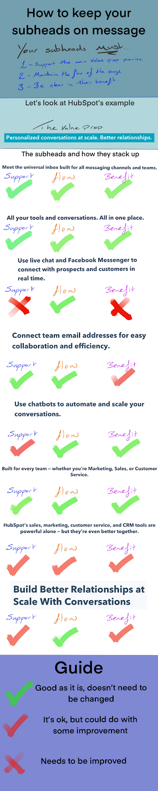
And now the detailed breakdowns for two of those sections.
I’ve broken them down by the three main areas subheads should be assessed on.
- Are they related to the value props promise?
- Do they maintain the flow of the page?
- Is the benefit clear?
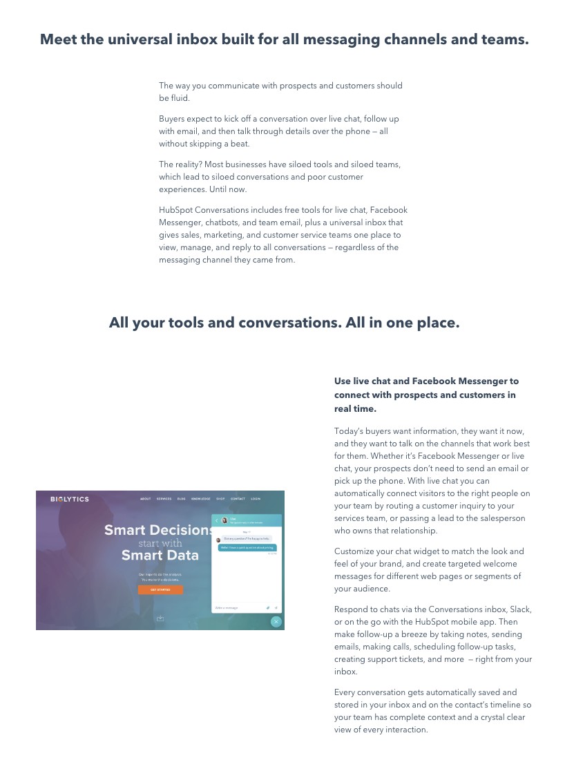
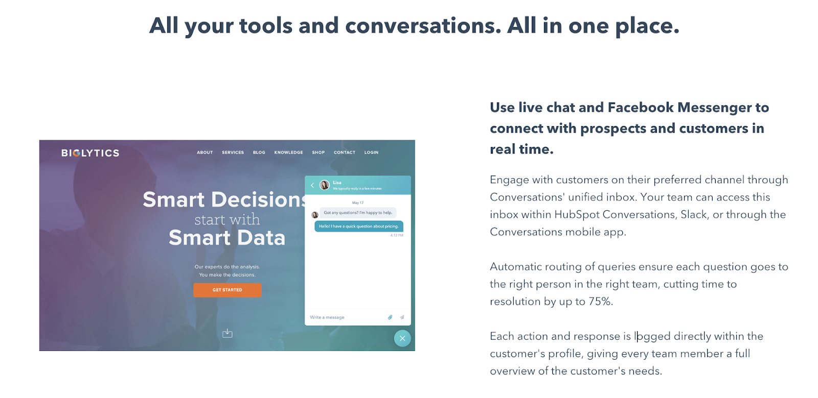
Meet the universal inbox built for all messaging channels and teams.
Related to VP Promise?
Is this related to the primary promise of conversations at scale?
Kind of, yeah. I mean, the thought of a universal inbox that pulls comms from multiple channels into one inbox would present a couple of benefits. Namely;
- Remove confusion and complexity from customer responses
- Allow a single operator to manage multiple channels
This, in turn, would save time right? It’d make the whole process a lot easier and thus more effective and efficient.
So this gets a tick from me on the relevancy to the primary headline and benefit.
Flow maintained?
Not bad for flow at all. You’ve hooked with the headline and jumped straight into a short lead on what the service is building interest.
The only thing I’d say might be needed is a little social proof between the hero and this section. Something to really solidify that attention and get them to scroll down.
That social proof could be;
- A simple star rating from a trusted third-party vendor (like this)
- A selected quote from a happy customer that also remains on the primary page message
- A mention of the number of happy customers (e.g used by XX,000 international brands)
Something along those lines to really make the user think “maybe I should give this a chance”.
Clear benefit?
The benefit here isn’t explicitly stated, but it won’t take a genius to connect the dots.
Using the “universal inbox” phrase lets people know this is a centralised way to organise their communications.
I’d give this one a pass. It could be punched up for effect, but for the initial run through it’s OK.
Use live chat and Facebook Messenger to connect with prospects and customers in real-time.
Related to VP promise?
This to me feels weak. I mean, I can see the benefit in there, but you’ve gotta dig. And I’ve kind of an unfair advantage in that I’ve worked in the conversational marketing space now for about 4 years (through various clients).
The risk here is that it’s a simple statement of the feature. There’s nothing there to explain how this is going to make the marketer’s life easier, how it ties into the idea of saving time, or the benefits they’ll receive.
I know from my work in the field that a speedy response can increase conversions by up to 400%. But if you’ve not done the deep dive on stats you’d never know this.
I’d give this one a low score on relevancy to the primary message. The good news is a little tweak can get it sorted (something we’ll do later). For now I’d mark it as an issue that needs addressing.
Flow maintained?
In terms of flow, fitting the features here works well.
It’s hard to say without the research HubSpot should have done, but you should lead with the most effective, desired, and needed feature here. I’m gonna assume this is it.
So, it’s good.
Clear benefit?
This is the first section that falls short on communicating the benefit.
The flow and the concept is good, but it’s not clearly communicated.
What I’d recommend is to go super clear and really hammer home the point of this being easier with something like;
“Automate real-time communications on the channels your customers are using”.
It’s a small change, but we shift the focus onto automation (to be in-line with the primary message) without sacrificing the mention of real-time comms across multiple channels.
We’re not spoon-feeding it to the user because they’re smart enough to understand what we’re referencing.
So that’s the process to double-check the subheads are on point and on message.
Now let’s look at the descriptive text that follows those subheads.
Landing Page Audit Step 4 – Descriptions
To improve your descriptive text you’re going to follow a similar process to that for the subheads.
However, you’re going to base the descriptive text not on the primary promise of the page, but on the promise made in the subhead.
Doing so leads to a hierarchy of sorts.
The primary promise is outlined in the hero section headline.
That’s expanded with subheads.
Those promises are explained in the descriptive text.
Which forms the base of the hierarchy of messaging.

This hierarchy achieves two things which aline with the general landing page best practices you’re aiming to maintain.
First, by tying everything back to the stage that immediately precedes it you’re ensuring consistent messaging.
Second, by building your subheads around the secondary and tertiary related benefits, you’re ensuring a more nuanced, but still highly persuasive, argument.
But most importantly, it helps you stick to one of the most important landing page best practices, one page, one purpose. Seriously, the power and importance of that one alone cannot be understated.
When it comes to description text I recommend taking the military approach.
We’re going to break each section down to its core components before rebuilding in a way that’s more effective for the page’s purpose (to drive conversions).
I’m not going to do it for all sections here, but rather for the first primary section.
Before I break it down, there’s a few things we should note.
When writing the descriptive text you need to remember that the modern reader doesn’t read. They scan. So you want to do away with huge chunks of text instead focusing on easily scannable elements.
Those elements include short sentences, good spacing, and the smart use of bulleted lists.
Let’s take a look at the first feature section on the page.
That’s a lot of text. And reading it, a lot of it is pretty unnecessary. The opening in particular reads like a poorly optimised blog opening.
So here’s what we’re gonna do. We’re gonna adopt a simple 4-step process to minimise fluff and keep the messaging as punchy as possible.
That process is;
- Identify key messages that support the page’s overarching message
- Extract those messages
- Rebuild them into a compelling, cohesive copy
- Add them back to the page

Let’s take a look at the HubSpot page to identify the key messages. For the selected section, the major messages are;
- Customers want to engage with your brand through their preferred chat channel
- Live chat can automatically connect visitors to the right team member
- Customise the chat widget to fit with your branding
- Reply to conversations from multiple places (inbox, Slack, mobile app)
- Make notes, follow up reminders etc direct from the chat
- Every chat is automatically saved for ongoing clarity and analysis
Not all of these are as on message as they could be. And I’d argue a couple are basic expectations for this kind of service.
Now we have the task of cutting it down to the 3 most pertinent options. I’d cut some and merge others to create the below.
- Connect with customers on their preferred channel from the service most convenient for your team (unified inbox, Slack, mobile app)
- Automatically route customer queries to the most appropriate team and person
- Every action is automatically stored on the customer’s profile so your entire team can understand what’s happened and what still needs to be done
I’ve stripped the above down to the three most important benefits for the user. The three things that are not only useful for their brand, but can also be tied back to the primary or secondary benefits we outlined.
To present this information, you can do one of two things.
If you’re stuck for time or resources, simply clean up the copy and present it as a list.
If you have a little more time then flesh the messages out as full sentences to be presented in a clearer format. Something like the below;
Again, this is a rough draft. But it’s far more succinct. It gets to the point, is more easily scanned, and yet doesn’t sacrifice the key messages.
Do this action of stripping down the key messages of your descriptive text, selecting what’s truly necessary, and then building them back up for more easily understood copy.
If you’ve been following the messaging hierarchy, you’ll get a page that has a consistent message promoting your primary goal.
Step 5 – Images
There’s a tonne of information out there on how to select or create the most relevant images. Not all of it good.
When selecting images for your landing page, there’s only really one golden rule you need to follow.
And that is…

“Does this help clarify or explain the key message?”.
You have to look first at the copy that accompanies the message and ask if the image helps achieve one of the below:
- Does it demonstrate what’s in the copy (think action shot, or demonstrative shot)?
- Does it clarify a difficult to understand aspect of the copy?
- Is it original?
The reason that 3rd option is in there is because it’s so frustratingly common to see those crap stock images on sites today.
And yeah, I know it can be beneficial to have a person on your site, but not when it’s “generic smiling brunette#3”.
Everyone can see that fakery a mile off and think you’re too lazy to put thought into your images or simply don’t care.
Now, in an ideal world you’d have a kick-ass designer to find the right angle and the right way to display it.
But this isn’t an ideal world.
At the very least, you can jump into your services dashboard and take some screenshots (or if it’s a product, put it near a few lamps to take a shot with your phone).
But in short, just make sure the image is related to the copy, message, and product.
Generally, HubSpot did a great job on the images.
If you read the subheads and descriptive text, the images are closely related to the feature being discussed. Take this one for example.
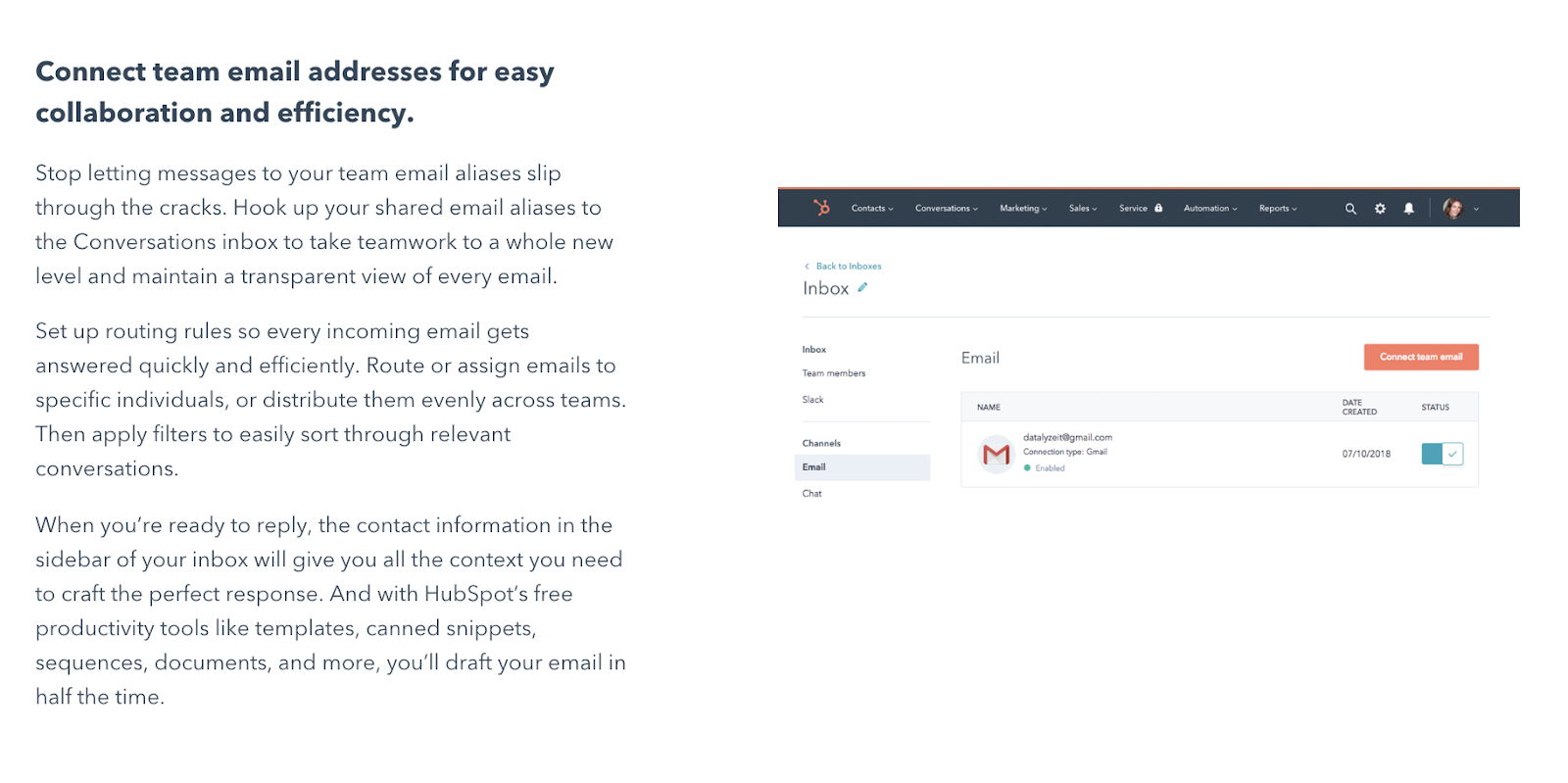
The subhead is talking about connecting team email addresses.
The image is the dashboard where email addresses are linked, and it shows how easy it is to see which are linked and which aren’t.
There’s nothing groundbreaking or highly creative here because it doesn’t need to be.
But the image is clear, which is 90% of the battle. .
It bolsters the message in that subhead and offers a visual explanation of the point.
That’s all you really need to do.
If you have/know a good designer, they can help you do that in a fun way. If you don’t then go simple and simply show the images as HubSpot have.
Landing Page Audit Step 6 – CTAs
CTAs take up surprisingly little real estate.
Unfortunately, that also means they often get very little thought.
Which is ridiculous because creating CTAs that outperform the majority of your competitors’ is surprisingly simple.
So let’s break down what makes a good CTA.
If we’re going deep, we can talk about motivations, promises, and context. But I want to keep this super simple. As such, I’d say there’s three basics your CTA needs to cover.
At a minimum, it needs to cover 2 of 3 of these.
- It needs to be crystal fucking clear in terms of what the user is gonna get
- It needs some form of “booster” (a reason to take the action)
- And if possible, reiterate the benefit of taking the action
In addition, your CTA needs to be extremely easy to find.
Like, “oh my god how could I miss that?” easy to find.
Contrasting colours that make it stand out are key here (and don’t believe the bullshit about orange buttons always converting better – that works only if orange is a standout colour).

OK, so let’s take a look at 2 of the CTAs on HubSpot’s page.
We’ve got two right in the hero section.
First off, they’re both super easy to find, so that’s good.
The nav bar reads “Get conversations free”.
The hero section CTA reads “start using conversations now”..
Personally, I think the nav bar is stronger.
Why?
Because it follows the simple CTA formula I like which is…
Why + booster
To elaborate, that’s why should I take this action?
And the booster is something to sweeten the deal. In this case “free”.
Sometimes free isn’t needed if it’s obviously free and the context of the page outlines that.
The hero section CTA is still good.
It outlines why the user should click and what they’ll get – to start using Conversations.
There’s a weaker booster that’s a kind of urgency element. That addition of now makes it seem like it’s a quick process.
But there’s no mention of free.
There is in the subhead at the top of the page. But it’s at the end of the small text.
However, because free is so prominently displayed at the top of the page I’m not gonna quibble on this.
In short, both CTAs are good.
The only CTA on the page I’d change is the below.
First, because “learn more” is super lazy when it comes to CTAs.
It’s like saying “yeah, you too” when someone says they love you. Sure, they know what you’re getting at but it’s the bare minimum.
Instead of that “learn more” I’d like something that told the user what will happen when they click.
Or rather, I would if I’d keep this CTA.
I’d much prefer to cut it completely because it’s a competing CTA that doesn’t contribute to the page’s main goal.
Downloads
Find the relevant downloads to help you improve your landing page below.